Rebranding
Novosibirsk
As part of a university assignment to rebrand a national company or place, I chose my hometown — Novosibirsk. I developed the full strategy, positioning, and visual identity from scratch. It was a professional challenge and a personal one: I know this city well, I’ve lived its reality, and I wanted to see how design could make it clearer, stronger, and more honest.
My role
Strategy, Identity, System
Design, Copywriting
Tools
Figma, Illustrator,
Midjourney, ChatGPT
Time
3 weeks
Capital of Siberia with no voice
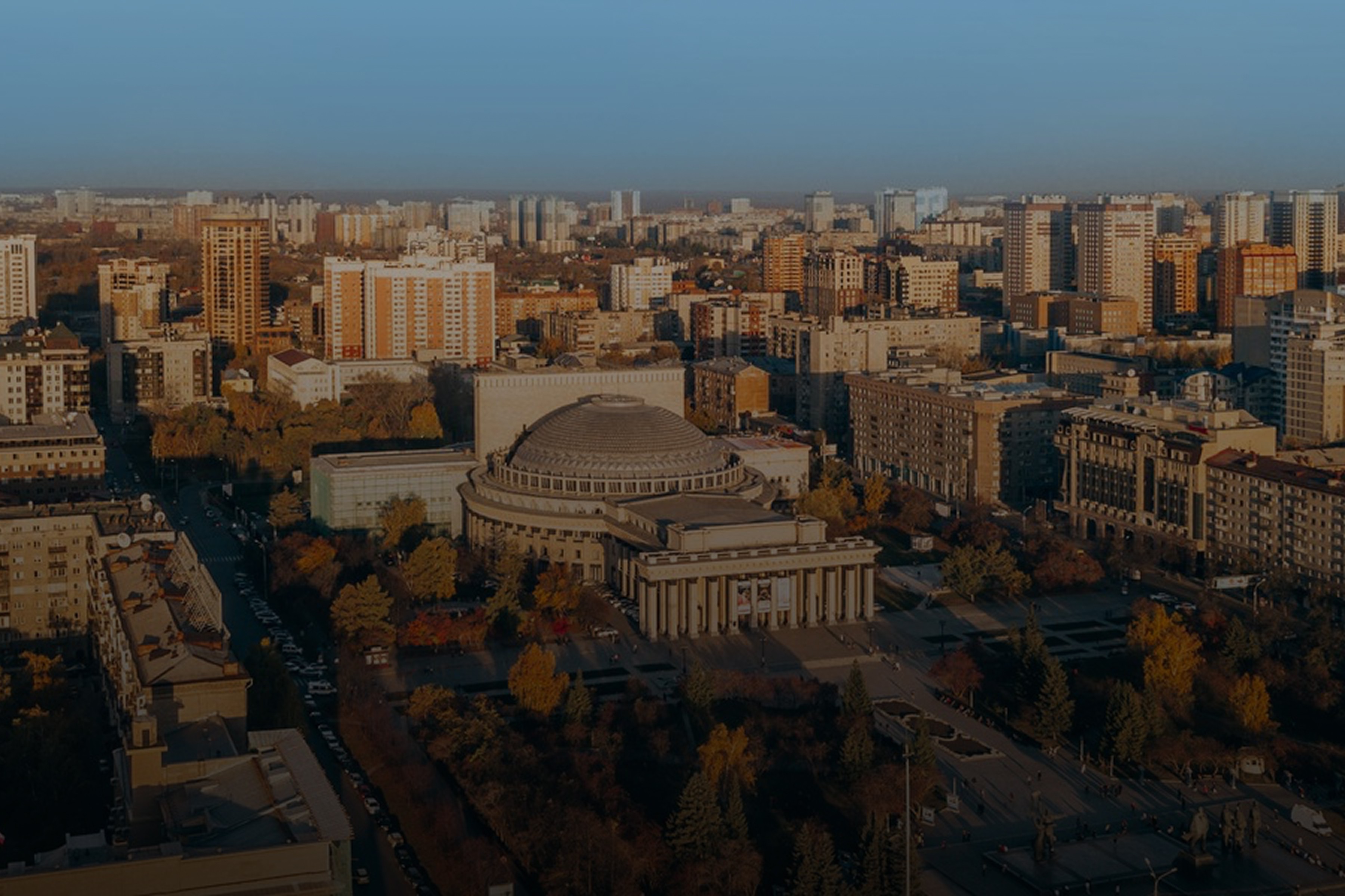
Novosibirsk, Russia’s third-largest city, had no real brand. There were separate visual identities for events or city departments, but no unified image or story. Old campaigns used outdated tools and didn't reach people. We asked locals to describe the city — most said it felt “cold,” “dusty,” and “grey.” But Novosibirsk is more than that. It’s unique, complex, and full of potential. The city needed a single voice. Not just to promote itself, but to reflect what it really is — and what it could become.
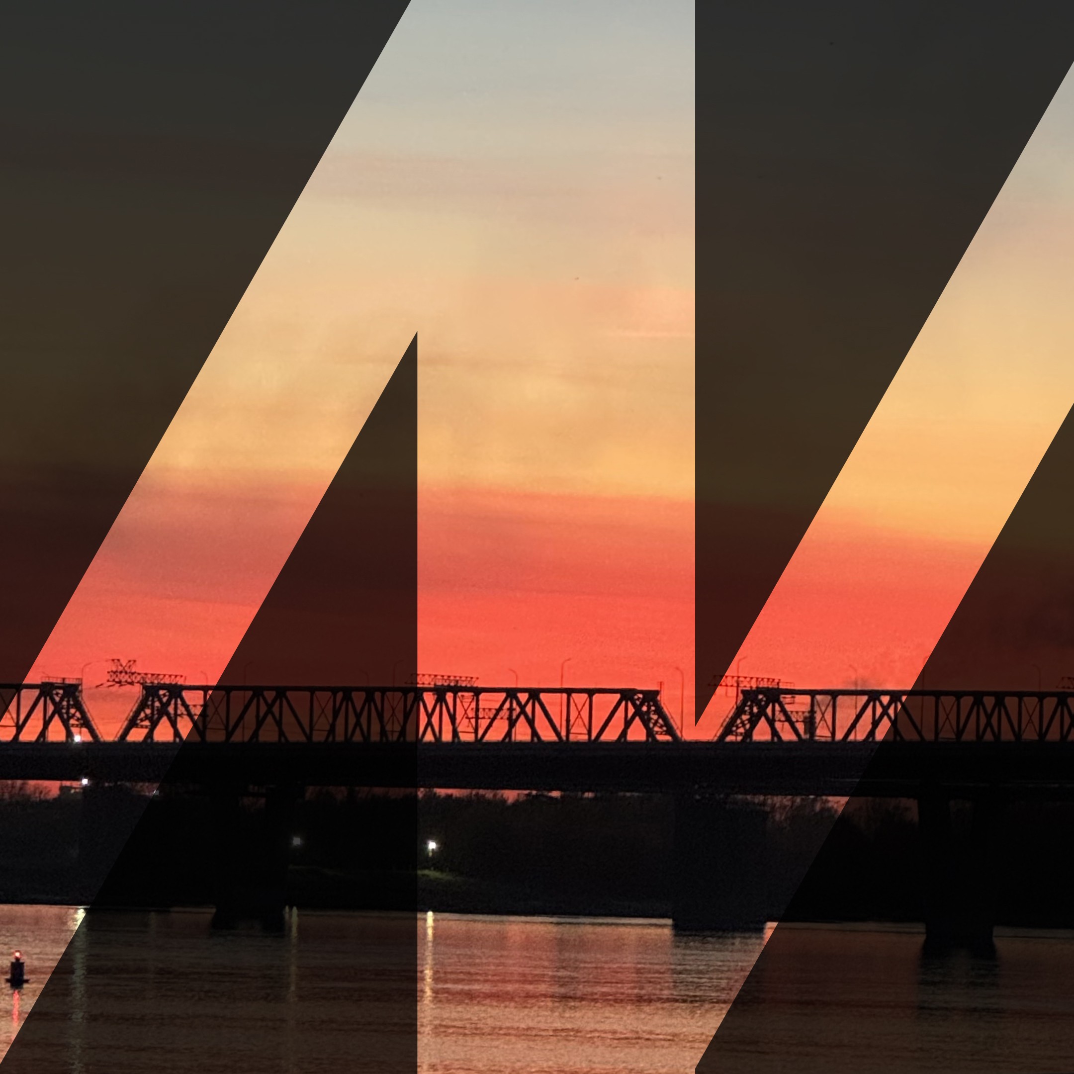
Contrast meets constructivism
Novosibirsk sits at the crossroads of east and west. It’s a connecting point — geographically, culturally, and emotionally. This identity is built around that logic of bridges. The city is full of contrasts: warm people in a cold climate, strict structure with creative energy. These opposites don’t cancel each other out — they define the rhythm of the place. The creative platform reflects that tension through constructivism. Not as nostalgia, but as a living system. Lines, grids, and shapes carry meaning. Everything is designed to build.

Opportunity
Everyone deserves a fair shot at growth

Curiosity
Innovation begins with asking right questions

Bravery
Pushing ideas into the unknown takes risk

Openness
To new people, ideas, perspectives and the world

Care
A mindset of responsibility: for nature, culture, and each other
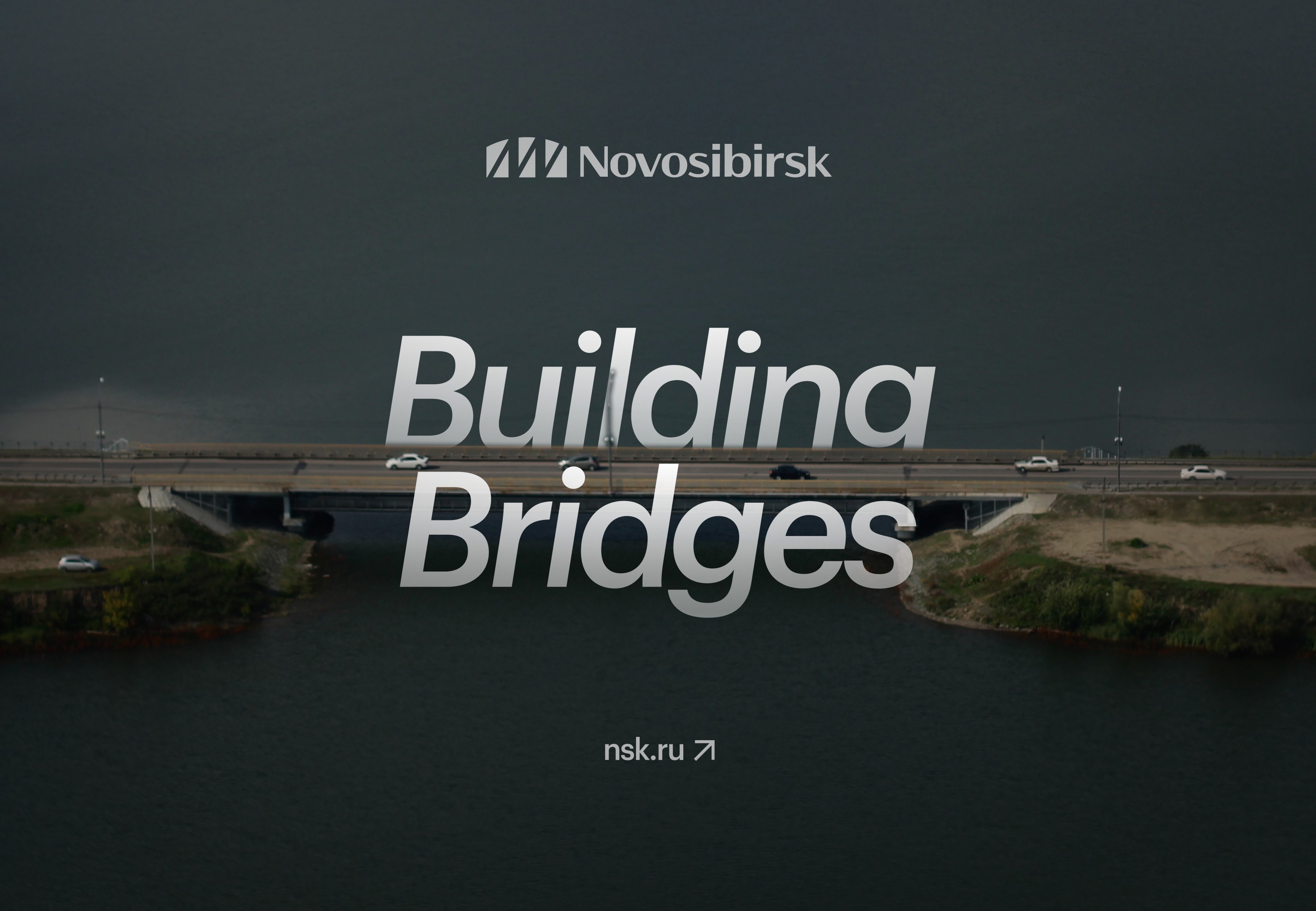
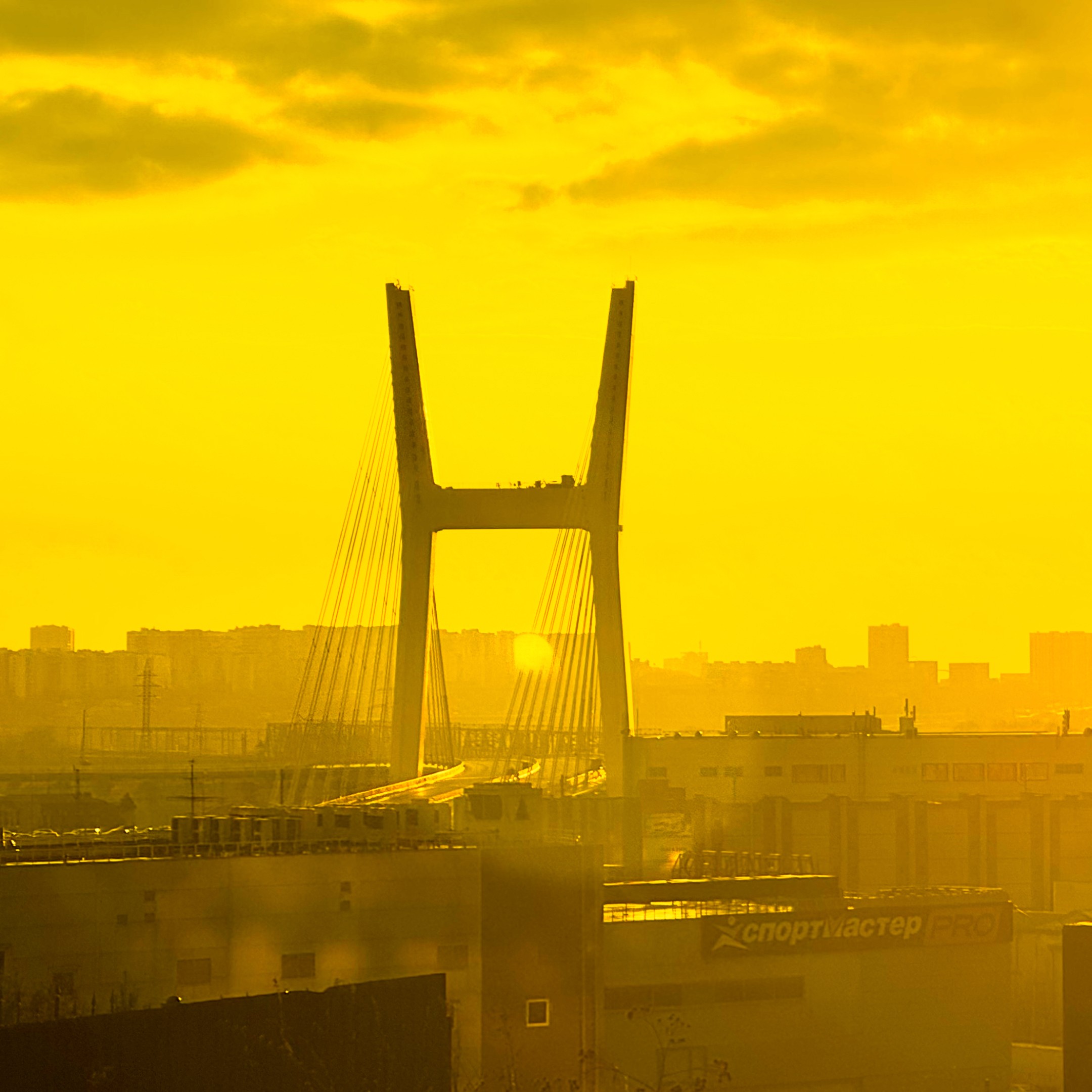
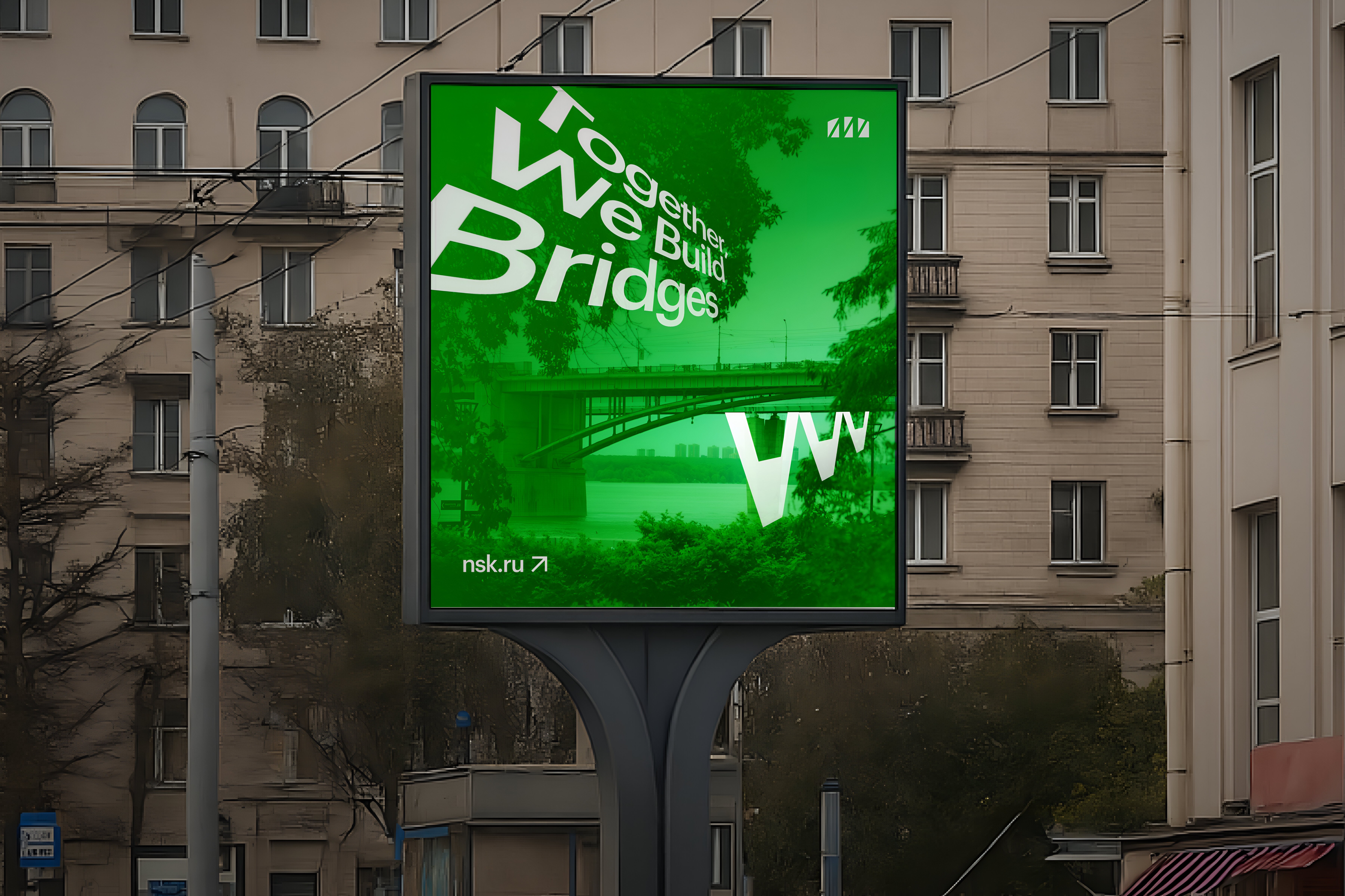
The bridge that made the city real
In 1893, the Trans-Siberian Railway had to cross the Ob River. That decision led to the founding of Novosibirsk. The bridge didn’t just connect two shores — it created a city. I used the actual shape of that first bridge and placed the Latin letter “N” inside it, standing for Novosibirsk. This symbol wasn’t invented — it was revealed. It reflects the city’s origin, its logic, and its values. It became the base of the entire visual system. Simple, confident, and built on what’s already there.

Typography as a form of self-expression
The project’s main typeface, NSK Font, was created by Dmitry Pilikov, a type designer from Novosibirsk. It’s inspired by handmade letters from 1960s Soviet and Eastern European book covers — when artists had to invent their own display types because proper fonts didn’t exist. That spirit of self-made design fits Novosibirsk well. It’s a city that improvises, adapts, and resists erasure. For structure and balance, we paired it with Graphik, a modern, neutral typeface that gives clarity without overpowering the character.

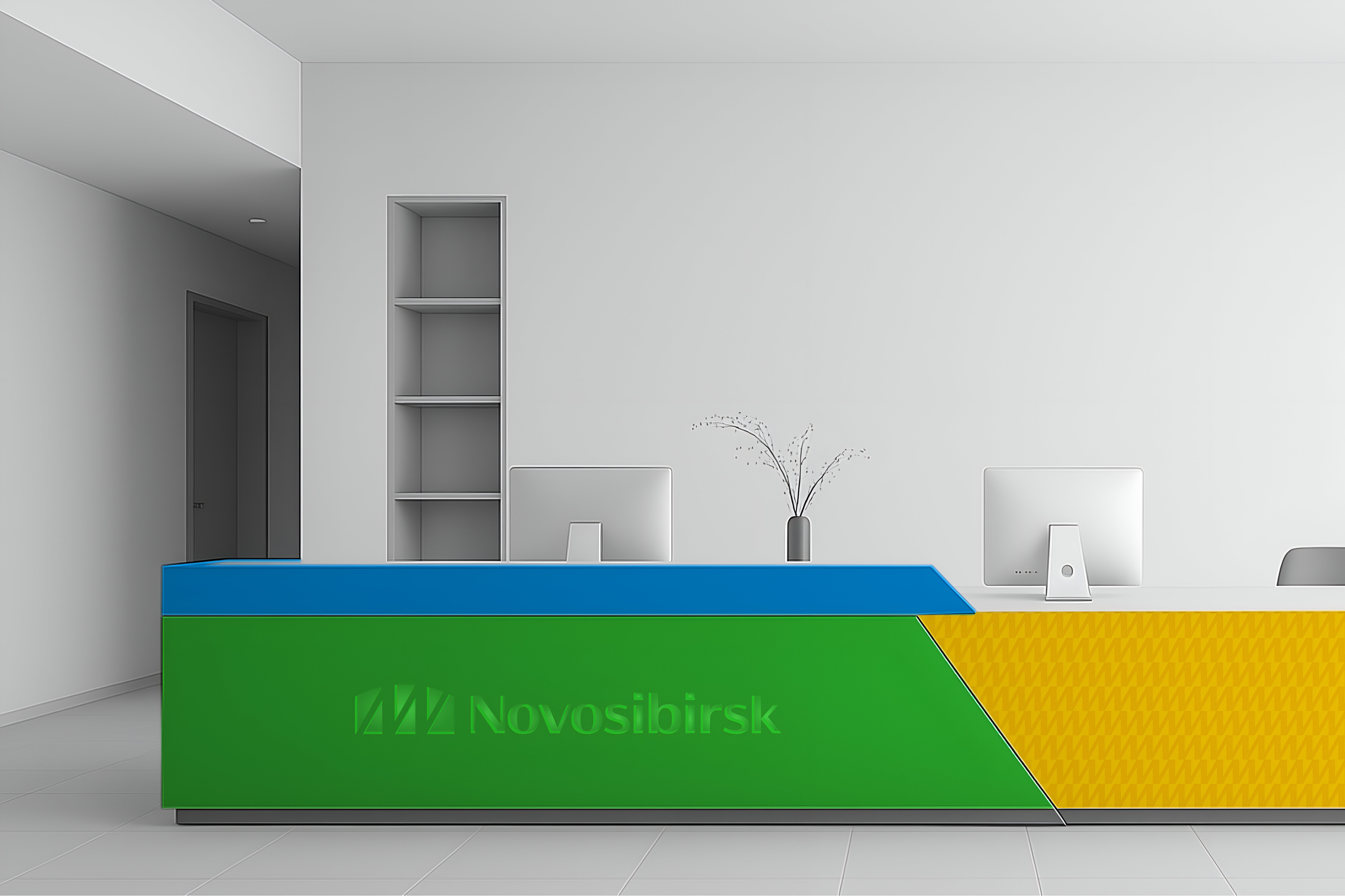
A color system that breaks the stereotype
For a Siberian city, the expected palette would be icy blues or greys. But Novosibirsk deserved something more alive. The colors were chosen to shift that mental image: forest green and sky blue reflect nature, while bright yellow brings surprise and warmth. It references the region’s forests and its many sunny days — a hidden truth behind the grey stereotype. The palette makes the city feel less distant and more present, without losing its authenticity.

Sunny Yellow
AAA
AAA
AAA
AAA
Lush green
AAA
AAA
AAA
AAA

Fresh Blue
AAA
AAA
AAA
AAA
Seeing the city through local eyes
Every image in the project is real. Shot by local photographer Masha Korolyatina, the photography captures people and places with honesty — not posed, not filtered, just how they are. We chose to work with local creatives intentionally, to support their work and show the city through their lens. The photos document rather than decorate. It’s about building trust. What you see is what’s there.


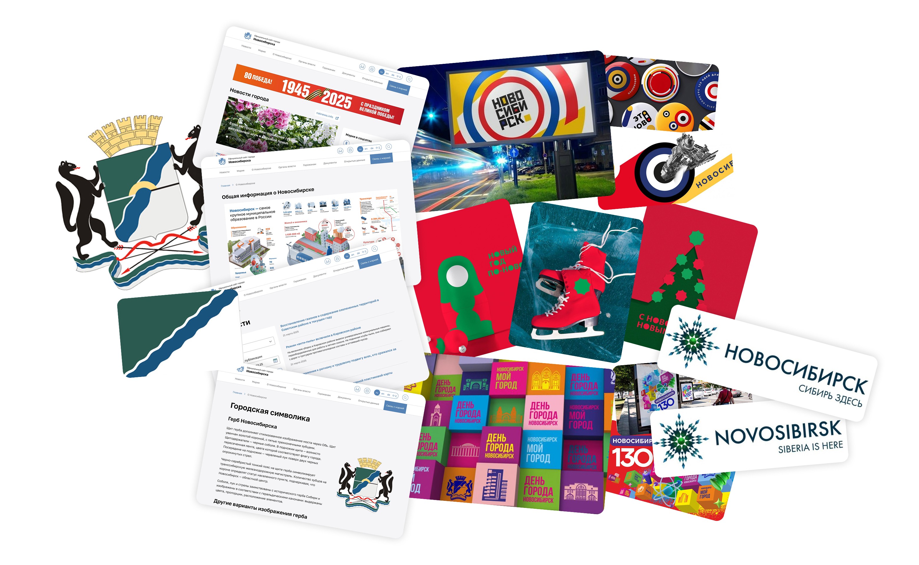
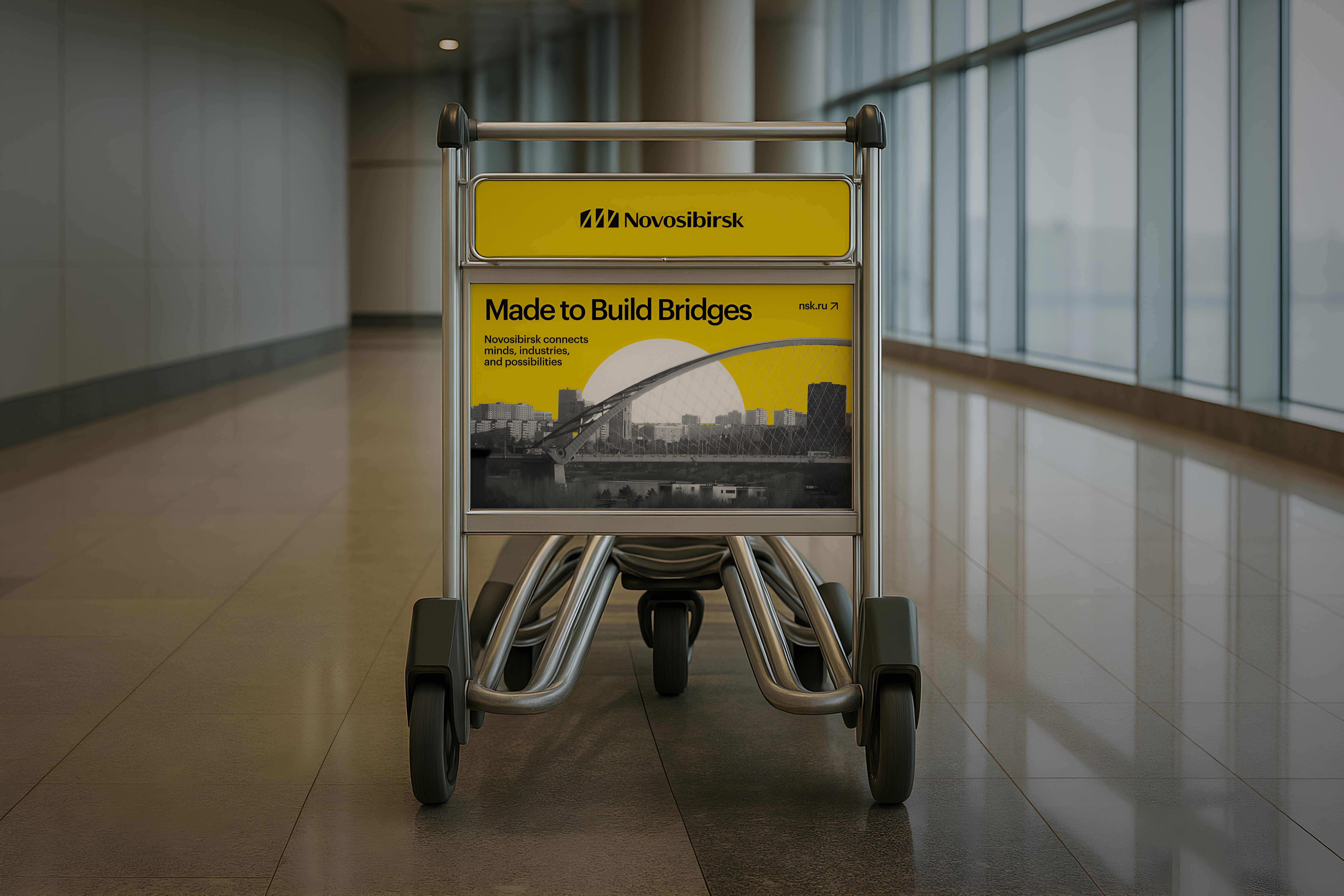
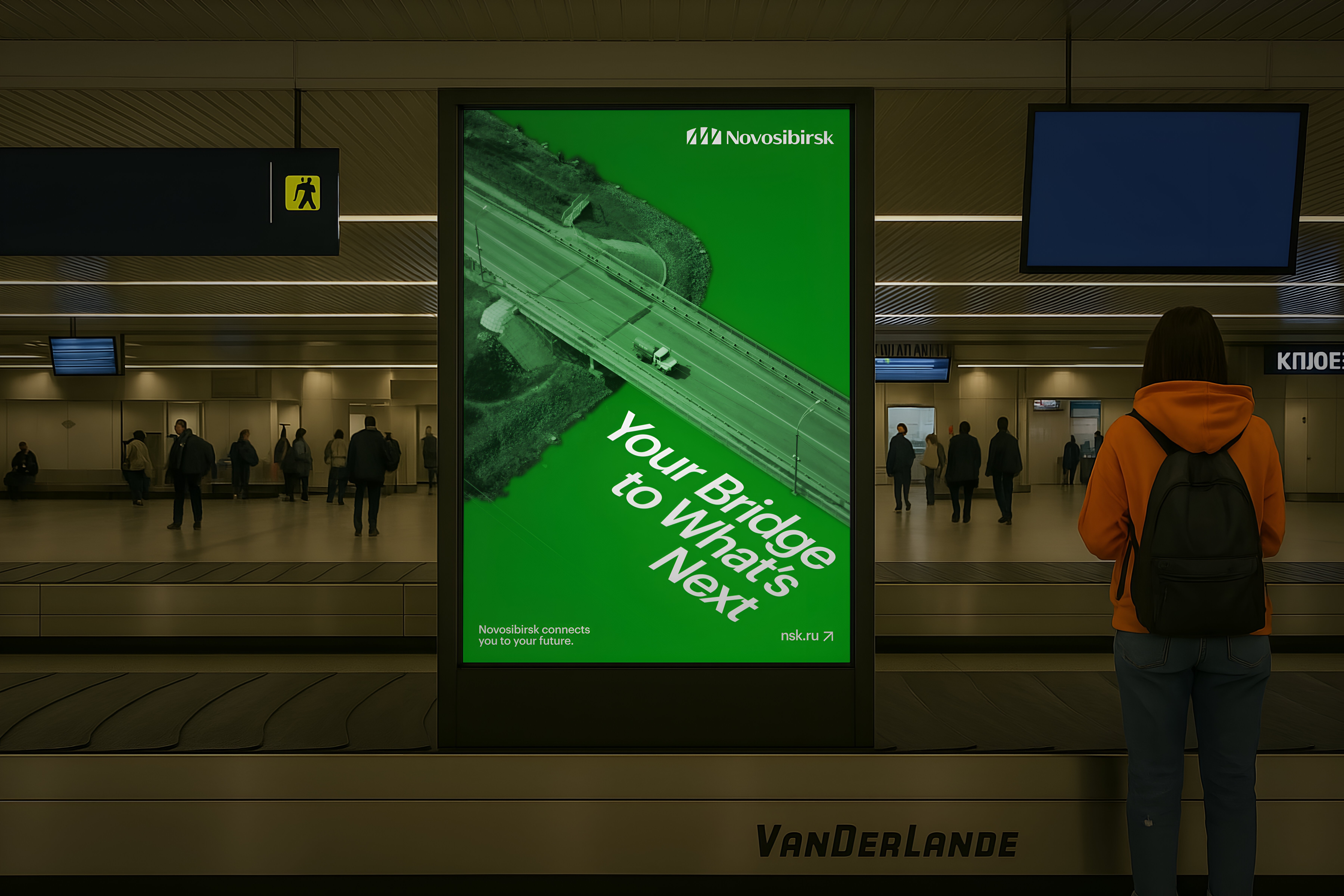
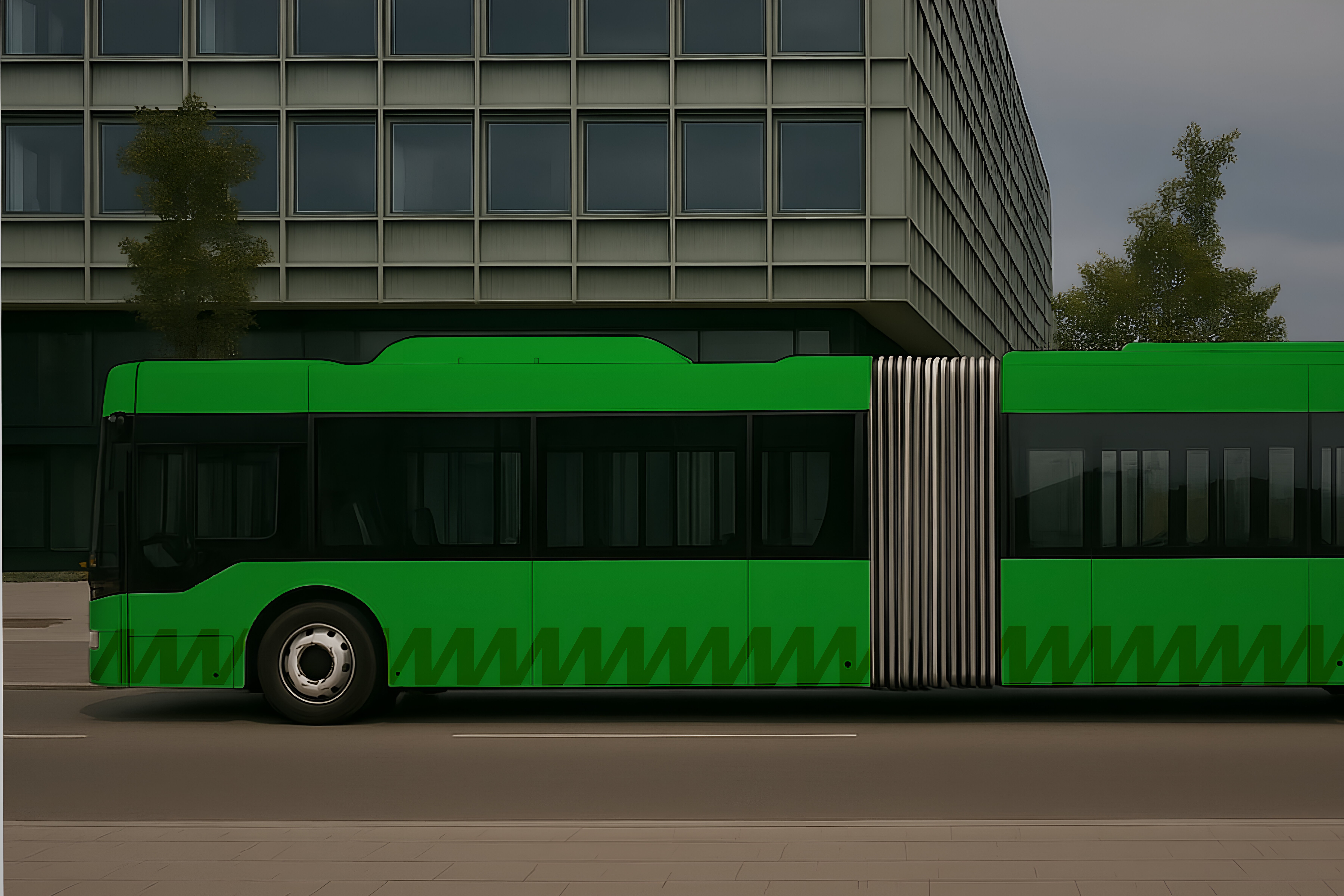
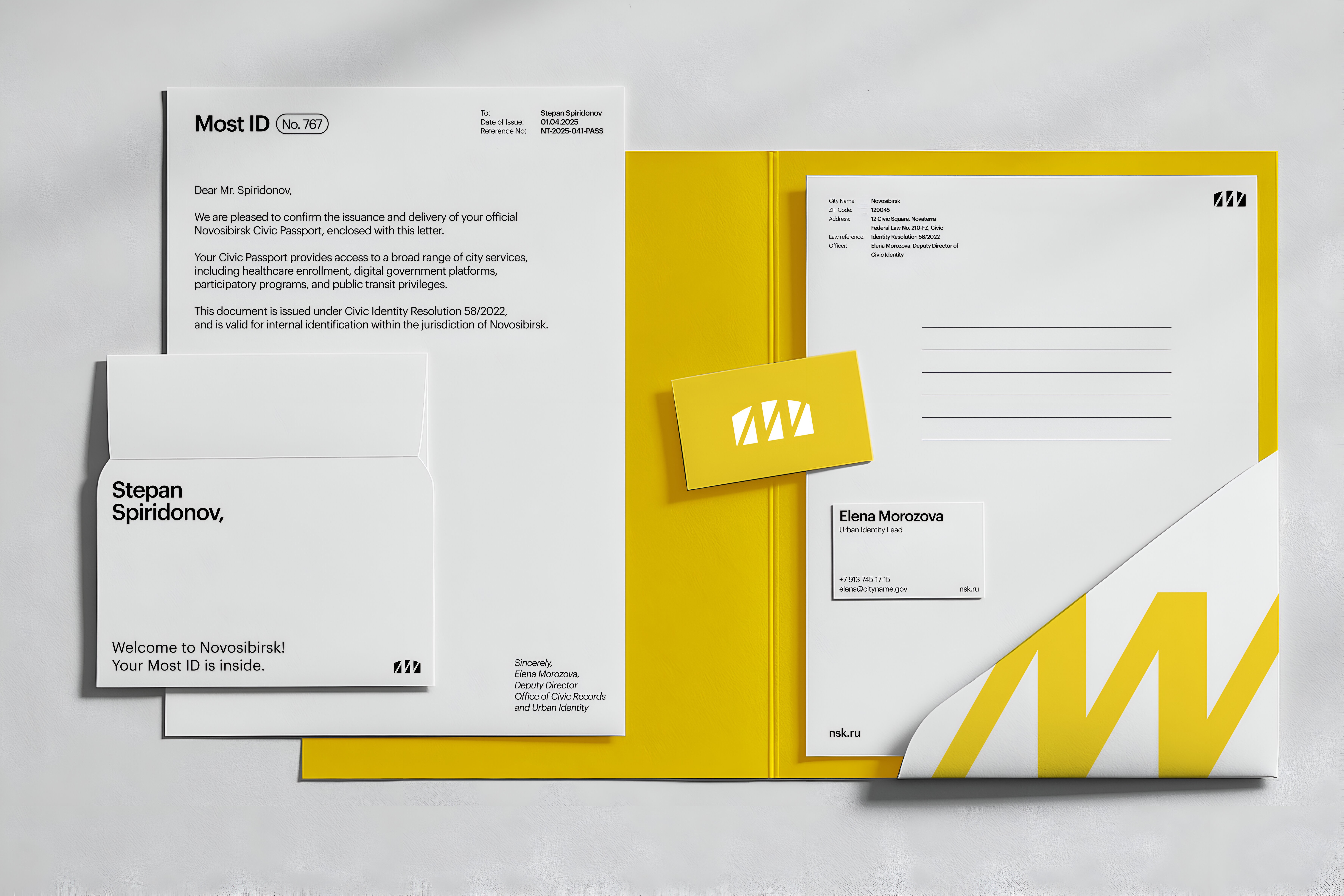
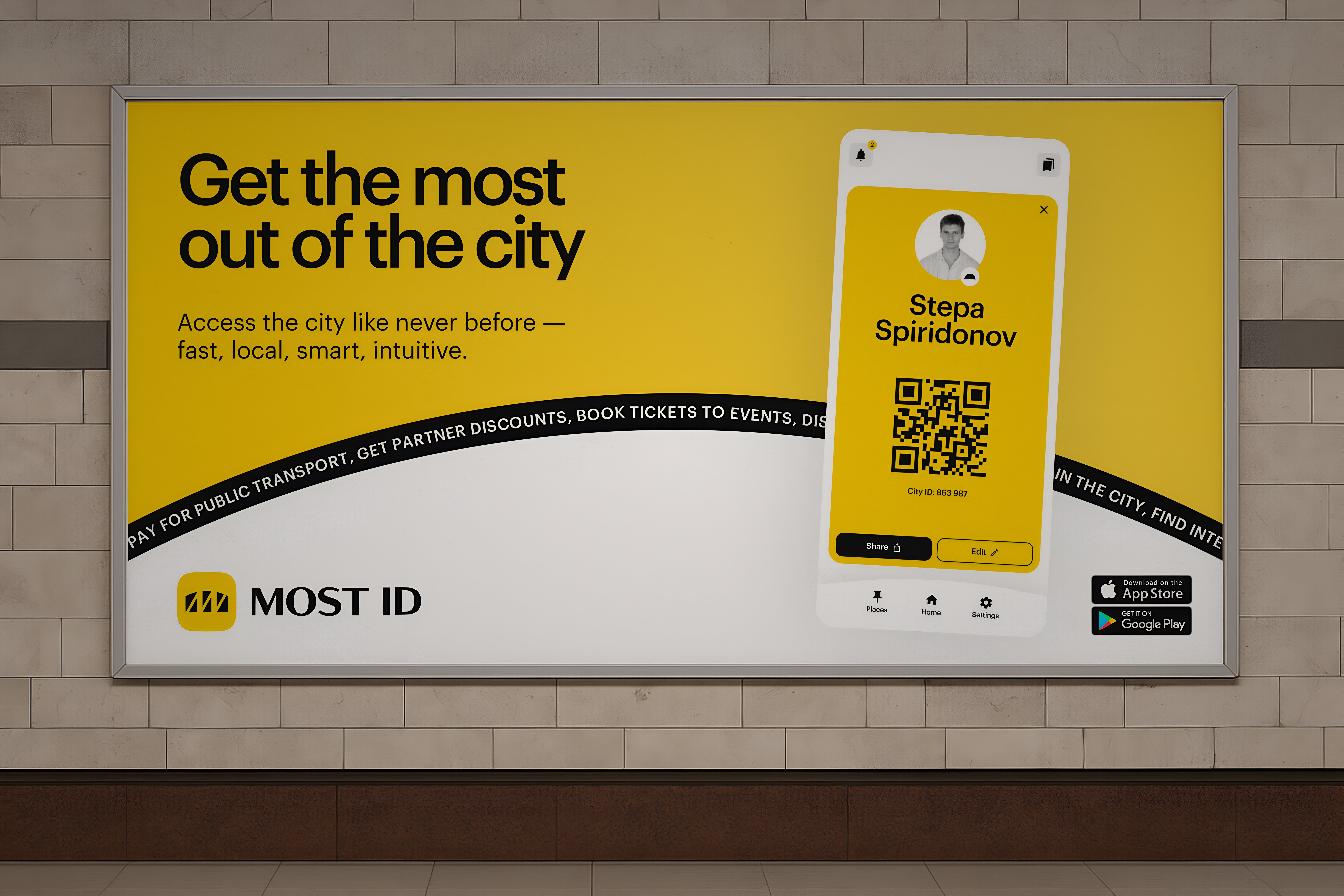
Identity built to work at every scale
The new identity works across every part of the city’s communication. From airport ads in other regions to local billboards, from public transport to digital services, from documents to apps — every touchpoint is part of one system. It adapts across contexts without losing clarity or tone. Even merch and signage follow the same visual logic. The identity doesn’t just look consistent — it feels whole. Everything is connected. Everything makes sense.

The new brand gives Novosibirsk a clear, bold and local voice, it connects people, place, and history through form, function, and feeling. For the first time, the city looks like itself, innovative, bright, and full of meaning.
Credits
Diego Marini
Masha Korolyatina
Dmitri Pilikov
View project
Get in touch
Page is available only on desktop
Error 325